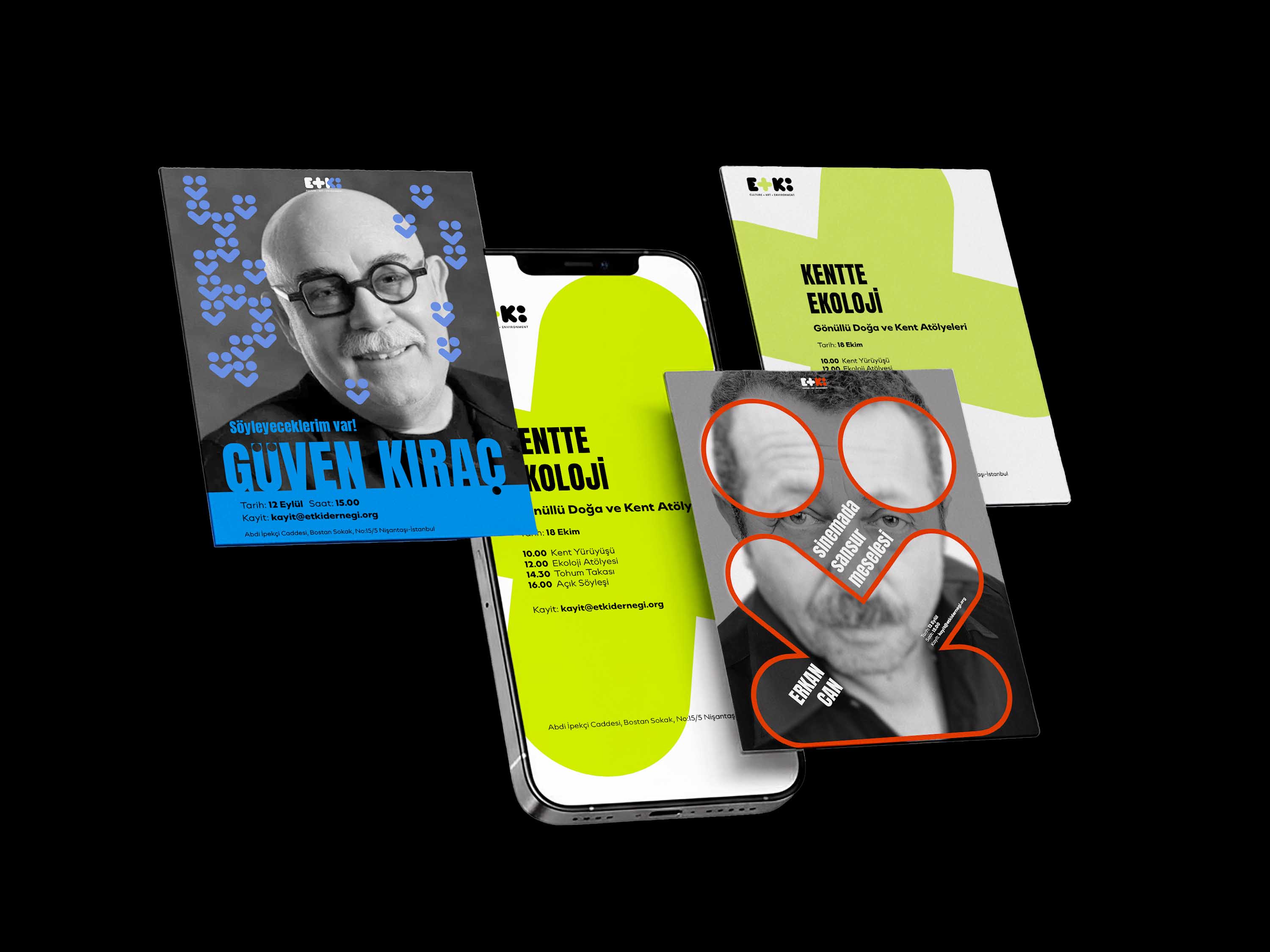
ETKİ Association
Logo Design · Identity System
In Turkish, etki means impact, effect or influence — a word that reflects the association's aim to create meaningful change through collective action.
ETKİ is a non-profit organisation working across culture, art, environmental awareness, education and research, supporting both individual initiatives and civil society.
The logo translates this multidisciplinary structure into three interconnected visual fields: Culture, Art and Environment.
One Identity, Three Fields
Rather than creating separate sub-brands, the identity was designed as one flexible system.
Culture, Art and Environment are distinguished through their own colour and symbol while sharing the same typographic and structural foundation.
The result is an identity that can adapt to different areas of activity without losing its connection to ETKİ.

A Modular Symbol Language
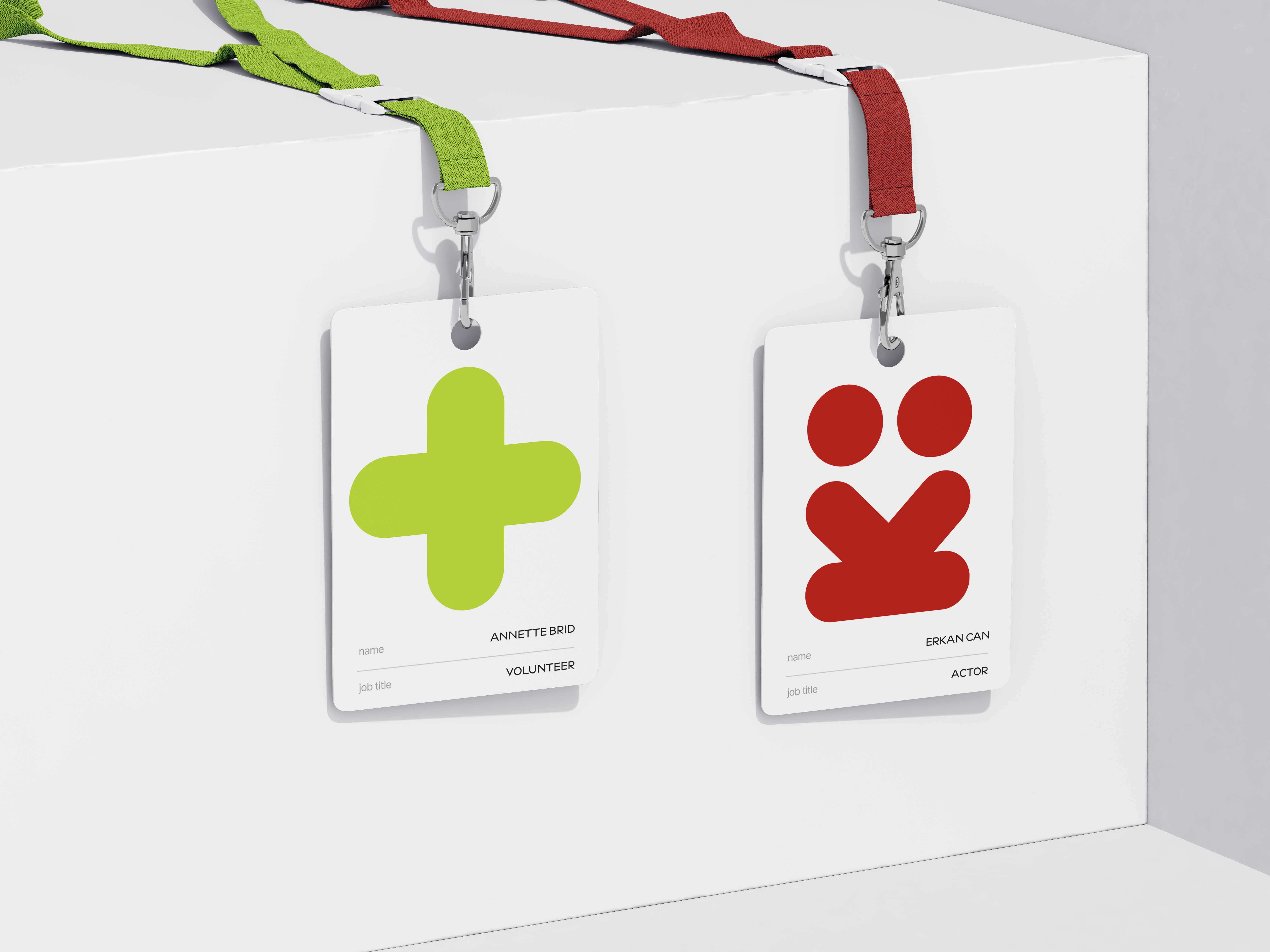
Each field is represented by a graphic element embedded within the logo.
These elements can function both as part of the wordmark and as independent symbols, creating a visual language that extends beyond the logo itself.
This modular structure allows the identity to adapt across different scales, formats and contexts.
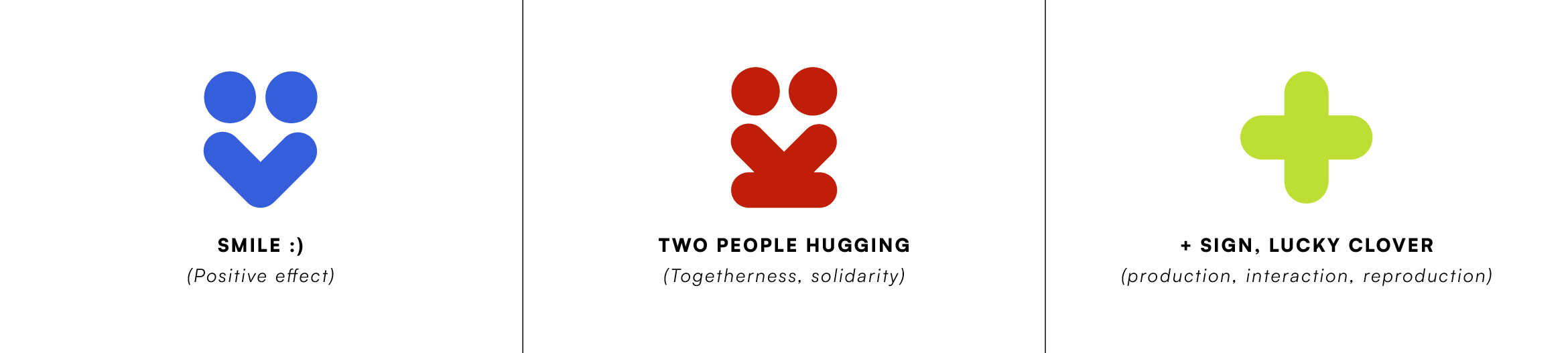
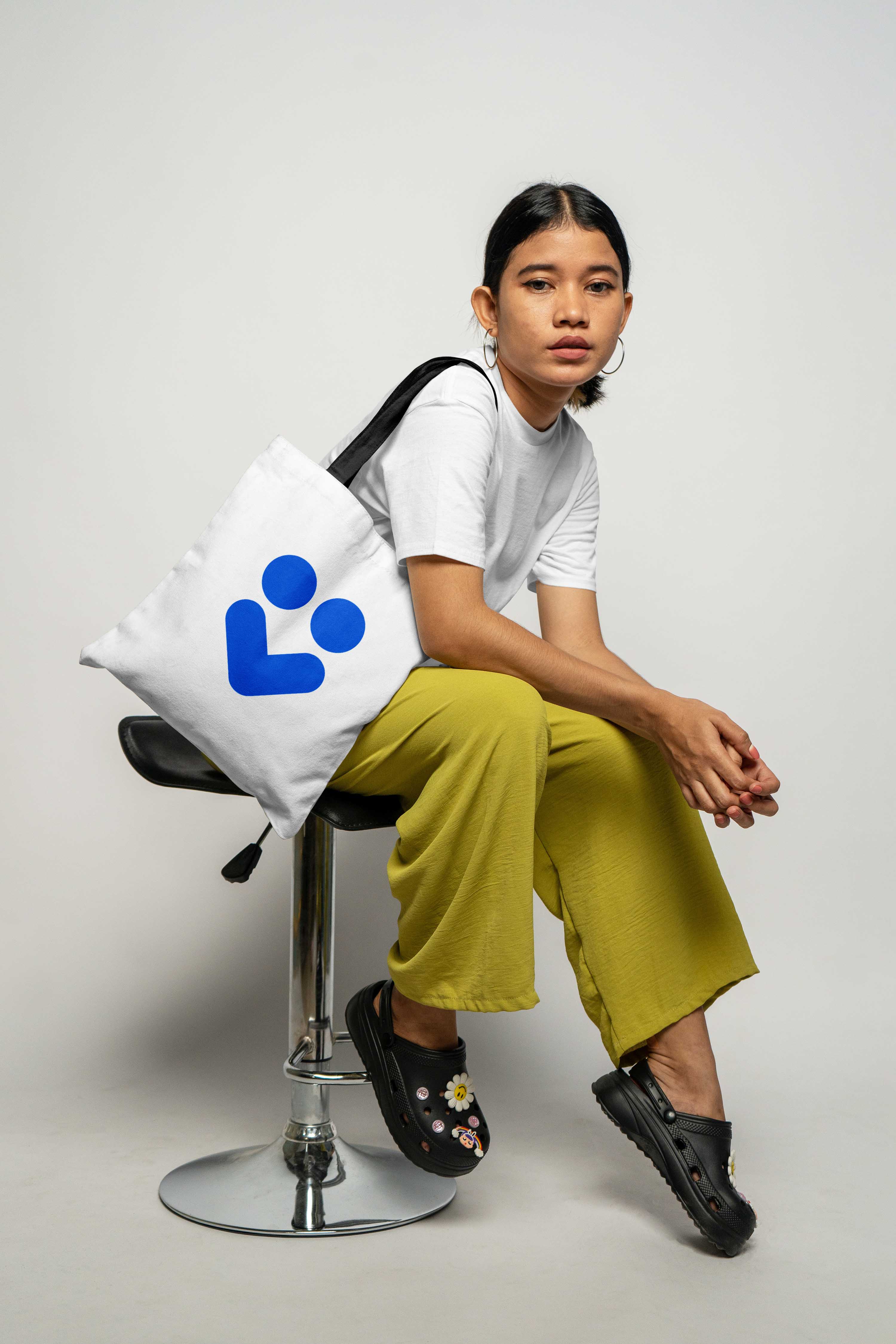
Culture
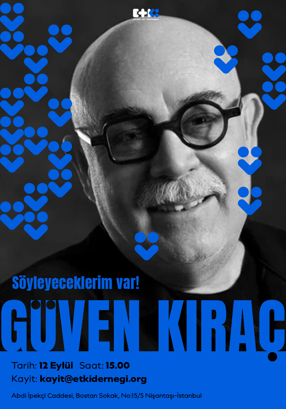
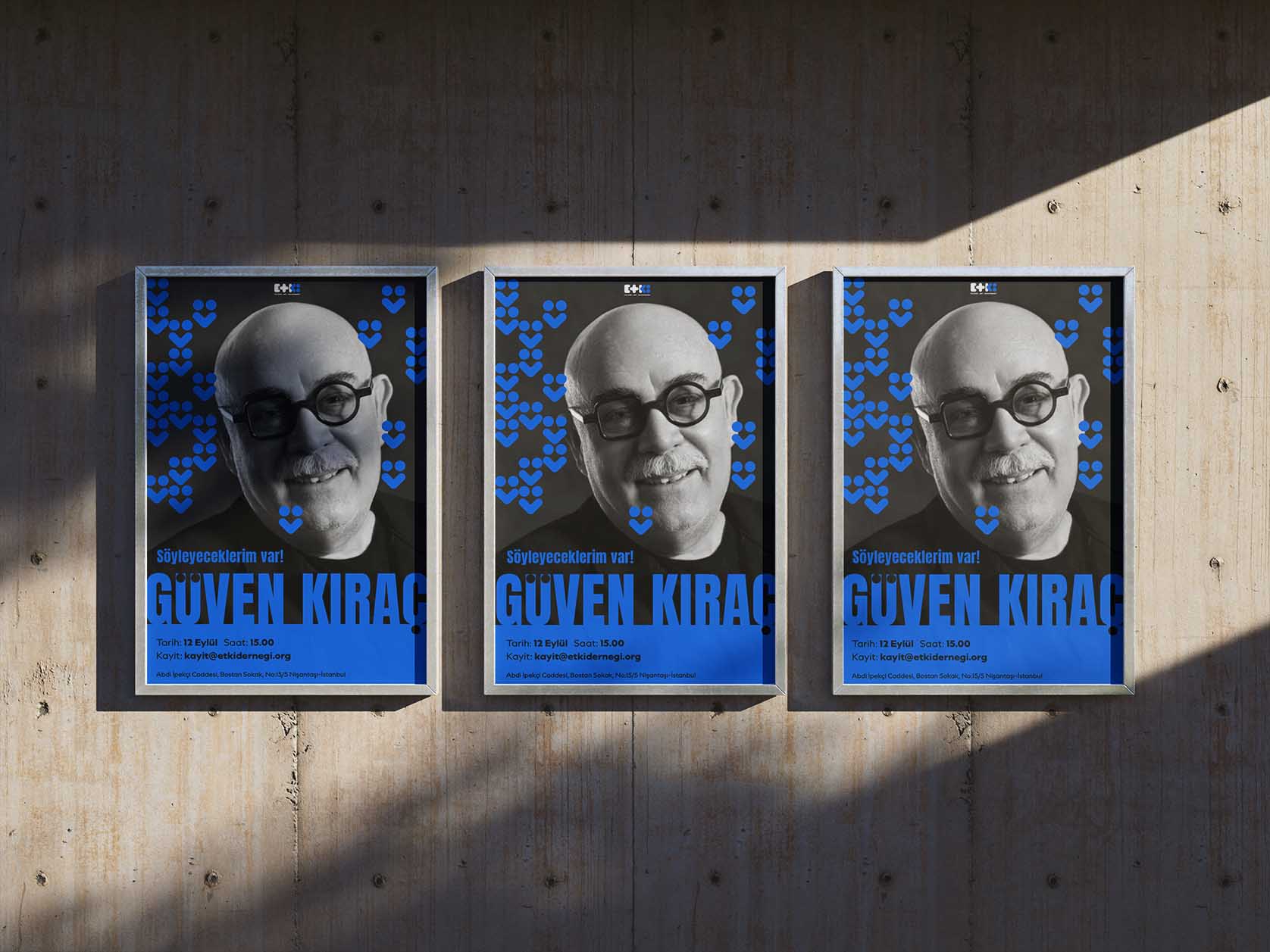
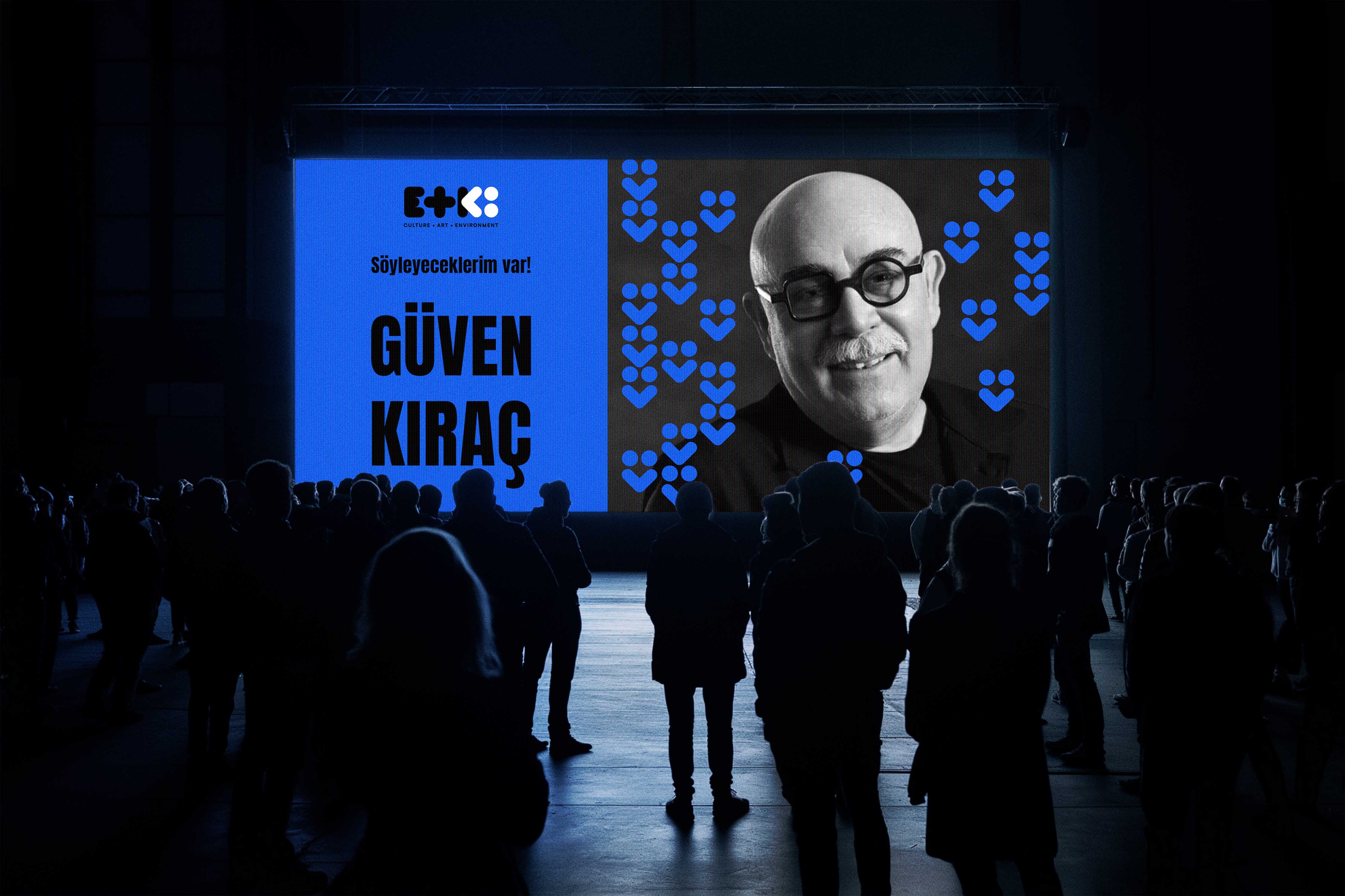
The blue identity represents ETKİ's cultural field, creating a visual space for dialogue, collective memory and cultural exchange.
For this conceptual application, the symbol expands beyond the logo and becomes part of the composition through scale, photography and typography.
Concept application · Cultural Programme

Art
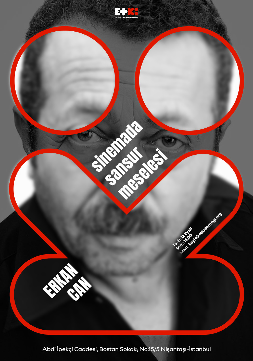
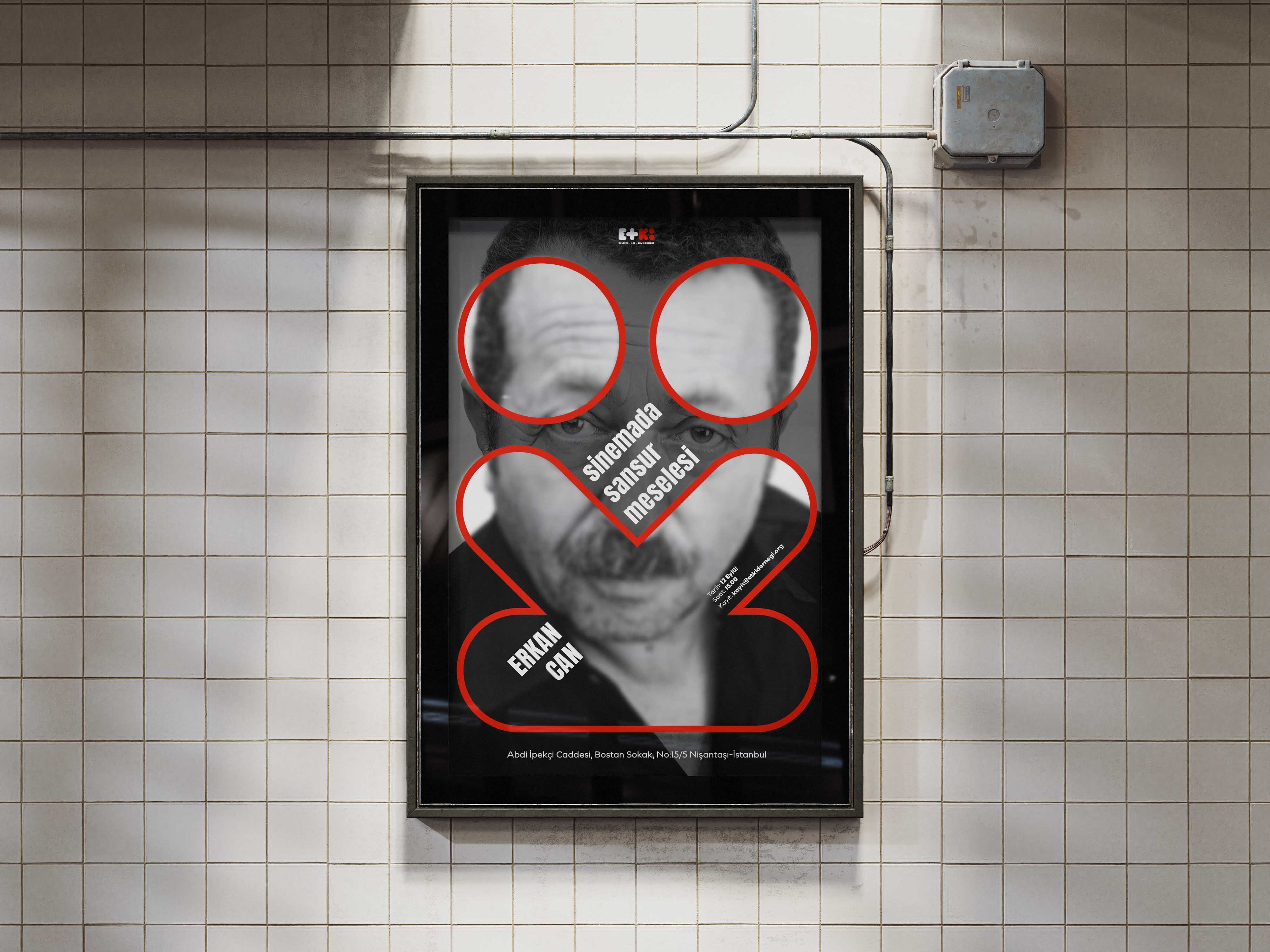
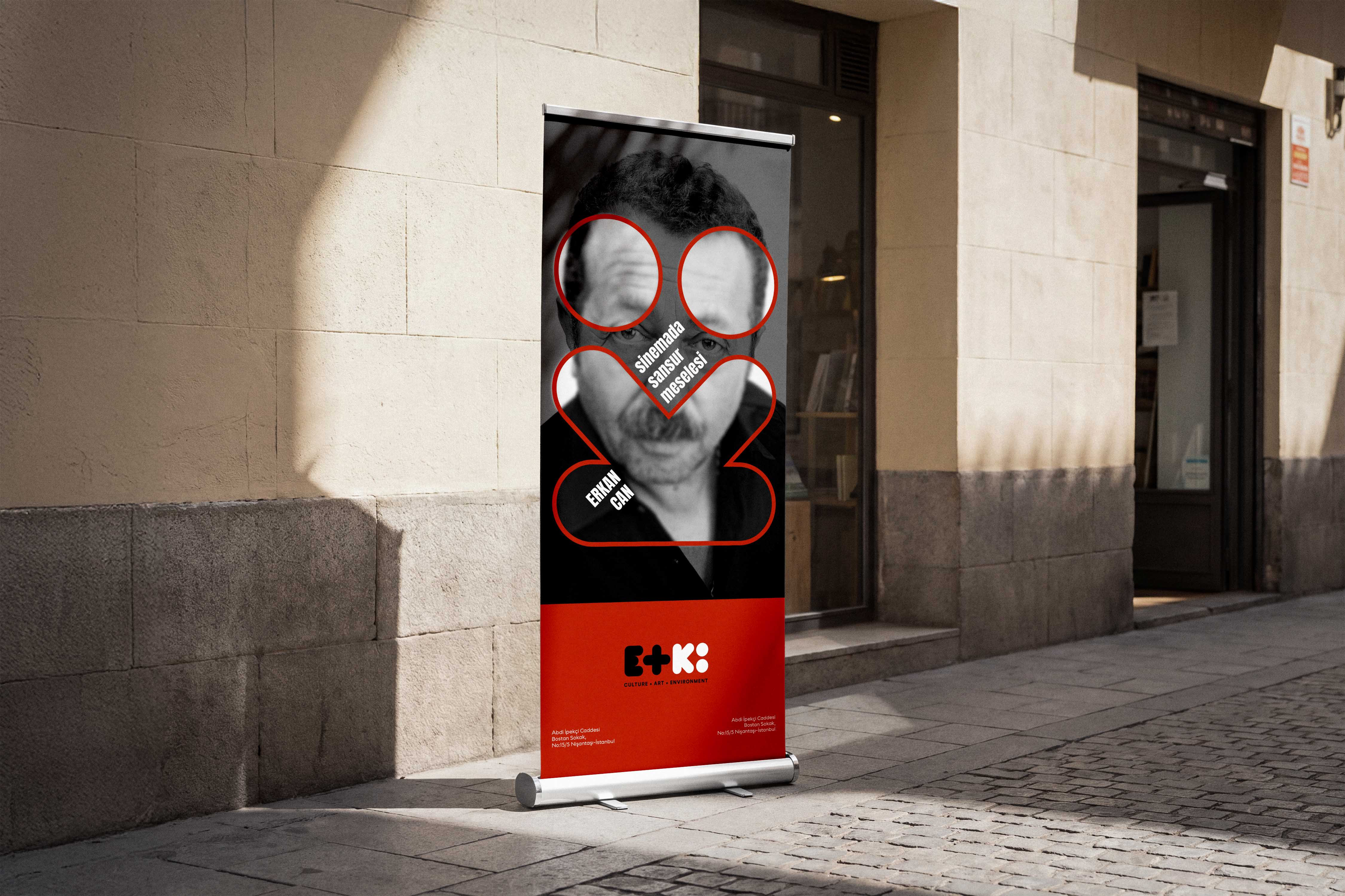
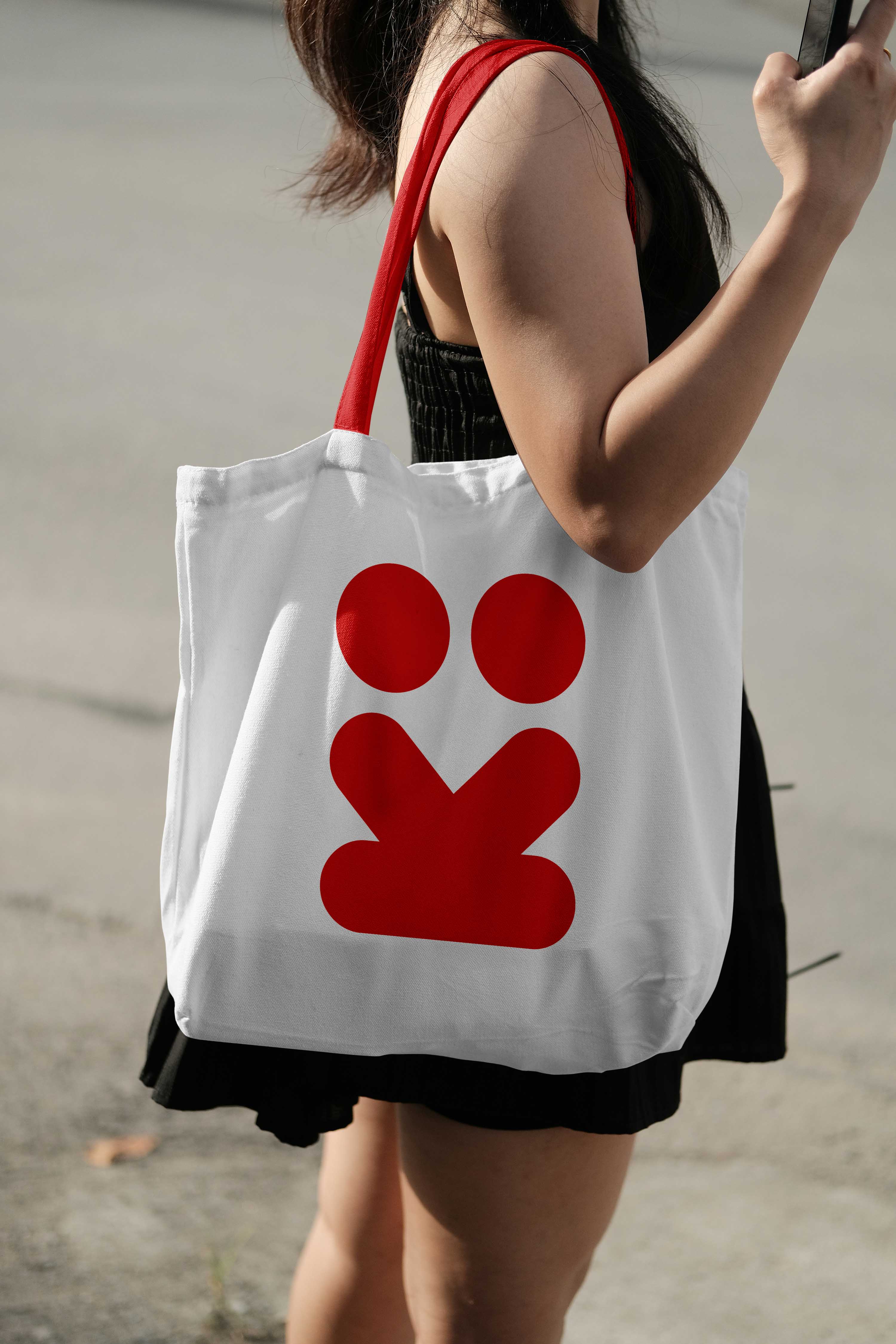
The red identity introduces a more expressive and experimental visual behaviour.
Its symbol becomes a flexible graphic device for communicating artistic production, collaboration and new forms of creative practice while remaining connected to the wider ETKİ system.
Concept application · Art Programme

Environment
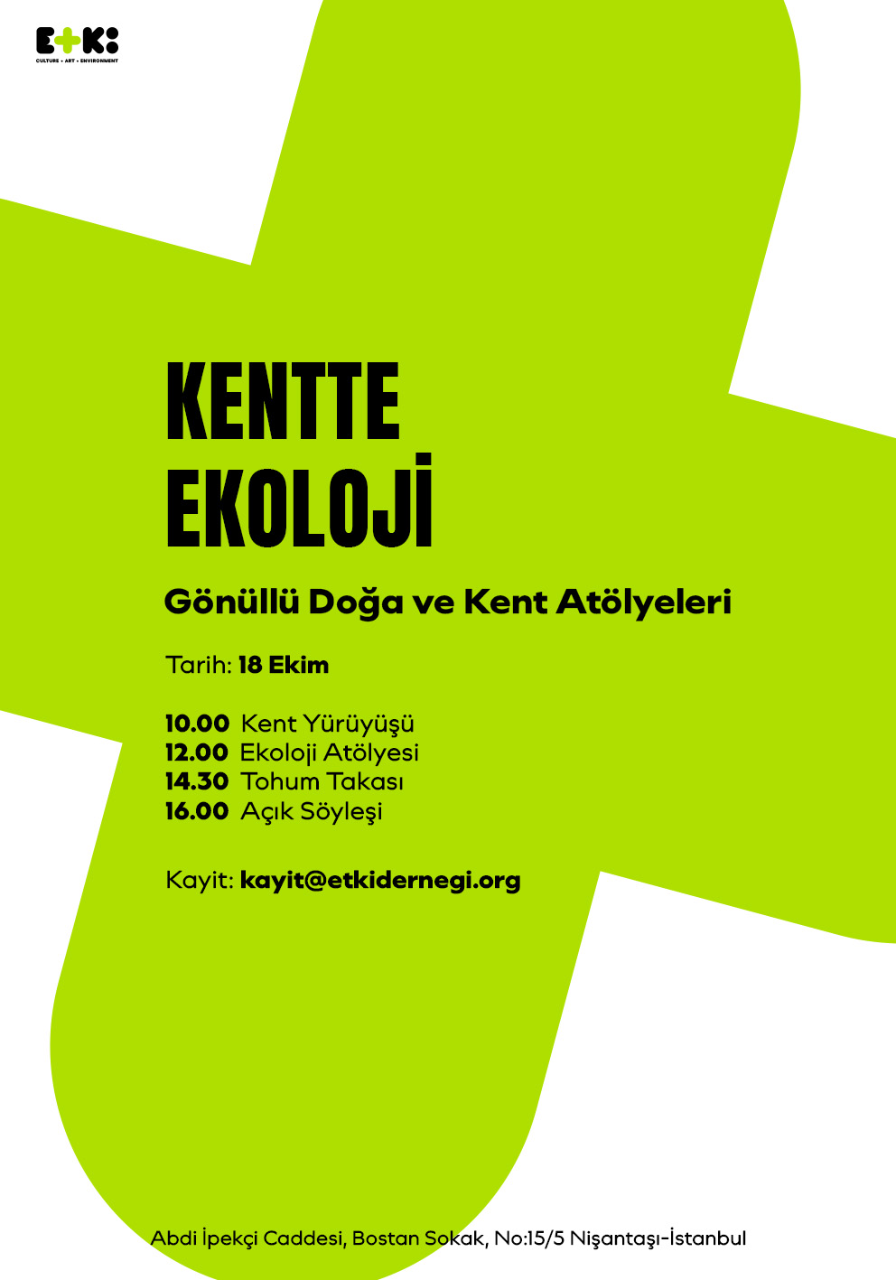
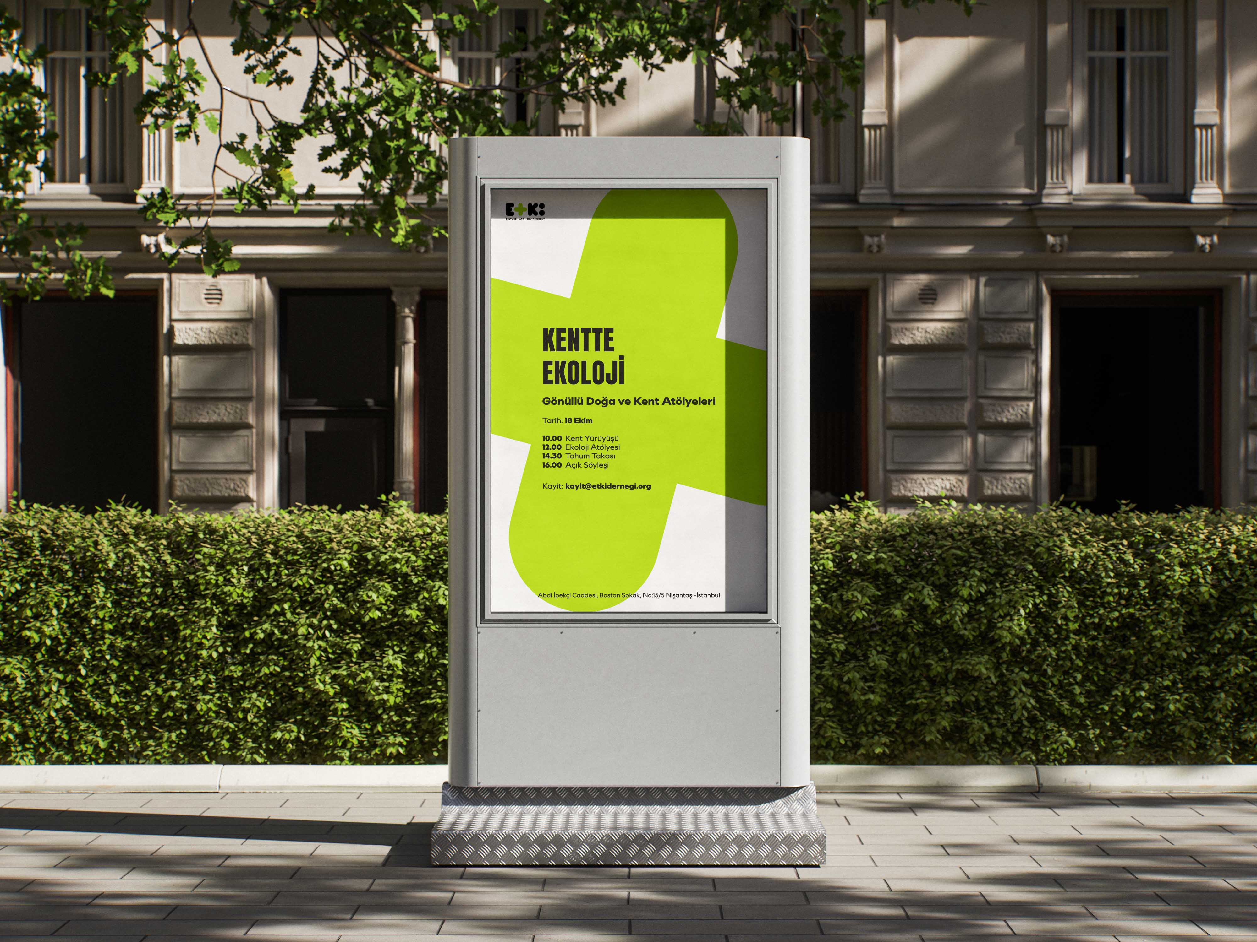
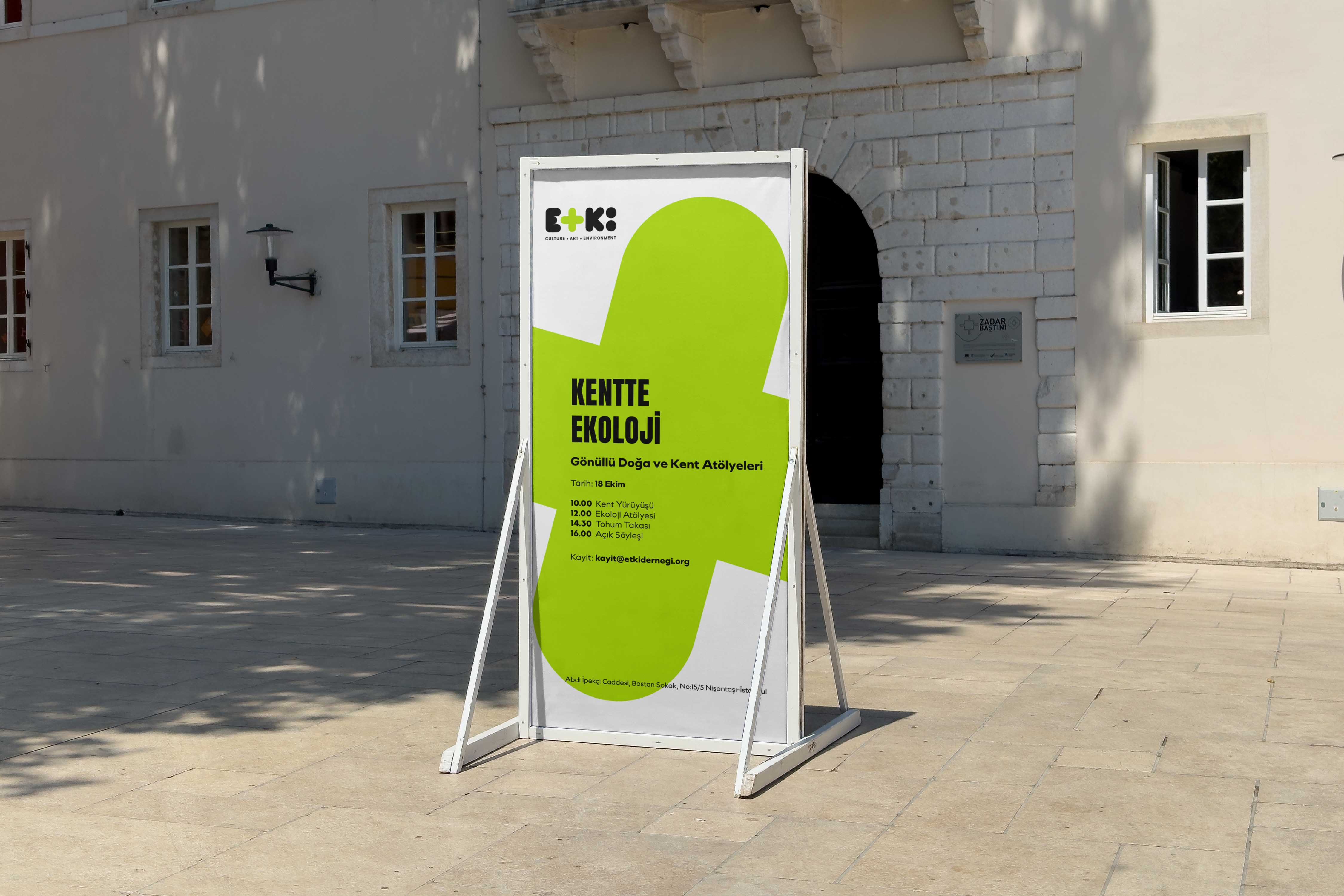
The green identity focuses on the relationship between people, urban life and the natural environment.
The plus symbol works both as an identifier and as a graphic element suggesting contribution, growth and collective action.
Concept application · Environmental Programme


A Shared Communication System
The three identities are designed to work independently without becoming visually disconnected.
Colour and symbol provide immediate distinction between the different fields, while a shared compositional and typographic approach maintains consistency across the organisation.
Together, they form a simple visual navigation system for ETKİ's different areas of activity.